So, you've built a local website, and now you're wondering why visitors aren't sticking around. Well, fear not, because we've got 12 practical tips to help you improve your local website UX and keep those potential customers engaged. From optimizing page speed to enhancing calls to action and streamlining payment systems, these actionable tips are designed to elevate your website's user experience. Stick around to discover how these simple tweaks can make a significant impact on your local website's performance and user satisfaction.
Utilize White Space Effectively
We enhance website usability by strategically utilizing white space to improve content legibility and draw user attention, creating a modern and open feel. White space, when used effectively, can increase user attention by 20% and contribute to a visually appealing and user-friendly experience. It is crucial to be cautious of excessive white space, as it may displace valuable information above the fold. Finding the right balance between content and space is essential for creating a clean, uncluttered design that enhances user engagement and satisfaction. By carefully incorporating white space into design elements, we can help users navigate and consume information more easily. Utilizing white space in this manner not only improves the legibility of content but also draws attention to surrounding elements, contributing to a modern and fresh feel for the website. Embracing the strategic use of white space is key to creating a website that is both visually appealing and highly functional, ultimately leading to a better user experience.
Optimize Page Speed
Transitioning from our discussion on effective utilization of white space, optimizing page speed is crucial for enhancing user experience and reducing frustration. Here are some key tips to help improve user experience with faster loading times:
- Compress Images: Compress images before loading them to significantly improve page speed. This reduces the file size without sacrificing quality, leading to faster loading times.
- Use Page Speed Tools: Take advantage of Google's free service to check page speed and get suggestions for improvement. This can provide valuable insights and actionable recommendations to boost speed.
- Monitor Performance: Regularly monitor and analyze the website's speed performance. This allows for identifying any bottlenecks and addressing them promptly to ensure faster loading times.
Enhance Calls to Action
Let's improve user engagement on our local website by enhancing our calls to action. Clear CTA placement and compelling CTA copy are crucial for guiding users effectively and prompting action. By analyzing call-to-action conversions and using emotionally compelling language, we can optimize and improve user engagement.
Clear CTA Placement
Strategically placing clear and prominent calls to action throughout the website enhances user engagement and guides visitors towards desired actions. When it comes to clear CTA placement in web design, consider these key points:
- Use contrasting colors and action-oriented messaging to make calls to action stand out and increase click-through rates.
- Position calls to action strategically above the fold and throughout the page to capture user attention at different stages of their journey.
- Test different placements and designs of calls to action to determine the most effective positioning for your specific audience and goals.
Compelling CTA Copy
Crafting compelling CTA copy is essential for prompting immediate action from users and enhancing the effectiveness of calls to action. By using action-oriented phrases and choosing colors and messaging that evoke an emotional response, local business websites can entice users to click. It's also important to use contrasting colors to make CTA buttons stand out and attract attention. Additionally, analyzing and optimizing CTA conversions using tools like heat maps can provide valuable insights into user behavior, allowing for further refinement of the CTA copy. Below is a table summarizing key strategies for creating compelling CTA copy.
| Key Strategies for Compelling CTA Copy |
|---|
| Use action-oriented phrases |
| Evoke an emotional response |
| Utilize contrasting colors |
| Analyze and optimize CTA conversions |
| Use heat maps for user behavior insights |
Differentiate Hyperlinks
When it comes to differentiating hyperlinks on a website, it's crucial to focus on clear link labeling, consistent link styling, and accessible link colors. By ensuring that the text clearly indicates what the link leads to, users can navigate the website effortlessly. Consistency in styling and using accessible colors is essential for improving user experience and increasing the likelihood of interaction with the links.
Clear Link Labeling
To enhance website usability, it is crucial to clearly differentiate hyperlinks by utilizing visual cues such as underlined text and distinct colors. When focusing on clear link labeling, consider the following:
- Stick to conventional hyperlink differentiation using blue and underlined text, as users expect this format for clickable links.
- Test the effectiveness of your links by blurring and removing color to ensure easy identification.
- Consider the length of the hyperlink for easy recognition and differentiation.
Utilizing consistent and clear link labeling not only enhances user experience but also improves navigation. By implementing these strategies, you can ensure that users can easily identify and navigate through the links on your website, ultimately leading to a more seamless and enjoyable user experience.
Consistent Link Styling
Utilizing a consistent style for differentiating hyperlinks is essential for improving user experience on local websites. Consistent link styling helps users easily identify and navigate through different types of content on a website. By maintaining uniformity in the appearance of hyperlinks, users can quickly recognize interactive elements and understand the navigational structure of the site. This can lead to a more seamless and intuitive browsing experience, ultimately improving websites' user experience. To illustrate the importance of consistent link styling, consider the following table:
| Link Type | Color | Underline |
|---|---|---|
| Normal Links | Blue | Yes |
| Visited Links | Purple | Yes |
| Active Links | Red | Yes |
| Hovered Links | Green | Yes |
| Disabled Links | Gray | No |
Accessible Link Colors
By employing distinct and easily recognizable colors for hyperlinks, websites can enhance accessibility and improve user navigation. When it comes to accessible link colors, there are key elements to consider:
- Stick to the convention of using blue and underlined text for hyperlinks to meet user expectations.
- Test the effectiveness of hyperlink colors by blurring or removing color to ensure they remain identifiable.
- Consider hyperlink length for easy identification and usability.
Differentiating hyperlinks effectively improves websites user experience and navigation. It ensures that users can easily identify and interact with links, ultimately leading to a more seamless and user-friendly browsing experience.
Utilize Bullet Points
When structuring content, employing bullet points enhances readability and facilitates the clear presentation of key information. Bullet points are a powerful tool to improve website user experience. They effectively organize and present information in a concise and scannable format, making it easier for users to grasp essential details. By utilizing bullet points, websites can highlight important information, break down complex content into digestible chunks, and guide users through key points. Whether it's presenting lists, comparisons, or step-by-step instructions, bullet points help in delivering information effectively. Their visual appeal also contributes to the overall user experience, making content more visually engaging and easier to comprehend. Incorporating bullet points into website content not only improves readability but also enhances the user experience by providing a clear and structured presentation of information. Therefore, when aiming to improve websites' user experience, leveraging bullet points is a practical and actionable approach that can significantly enhance the overall usability and effectiveness of content.
Use Images Strategically

We strategically incorporate high-quality images to enhance the website's visual appeal and support the conveyed message. When using images on a website, it's crucial to ensure they are of high quality and relevant to the content. Here's how we improve the use of images:
- Relevance: We carefully select images that are directly related to the content, ensuring they support the message being conveyed and add value to the user experience.
- Data-driven approach: We use analytics to understand which images resonate best with our audience, allowing us to make informed decisions about the types of images to use.
- Accessibility: We incorporate alt text for all images, making the website more accessible to visually impaired users and providing context for search engines to understand the content better.
Craft Well-Designed Headings
Crafting well-designed headings is essential for attracting attention and effectively communicating key messages on your website. Headings serve as signposts, guiding users through the content and making it easier for them to digest information. By using consistent headline design and aligning it with your branding, you can create a cohesive user experience that builds trust and recognition. It's crucial to choose relevant and compelling words for your headings to engage users effectively. A well-designed heading not only captures attention but also enhances the overall aesthetic and usability of your website. When crafting headings, consider the hierarchy of information and use clear, concise language to convey your message. This approach ensures that users can quickly understand the purpose of each section. By prioritizing effective heading design, you can significantly improve the user experience on your website, leading to higher engagement and satisfaction.
Maintain Page Consistency
Consistent page design and navigation are crucial for a seamless user experience. By maintaining uniformity in fonts, colors, and imagery, we can reinforce our brand and build trust with our audience. Clear navigation and consistent branding across all pages ensure that users can easily find what they need and have a positive interaction with our website.
Clear Navigation
Maintaining page consistency through clear navigation elements is essential for enhancing user experience and reinforcing brand identity. When it comes to clear navigation, here are some key points to consider:
- Consistent navigation elements such as menus and search bars across all pages ensure easy user orientation.
- Visual consistency through the use of the same fonts, colors, and imagery reinforces your branding and enhances user recognition.
- Uniform placement of navigation elements and important features provides a cohesive and familiar browsing experience for users.
Consistent Branding
To ensure a cohesive and recognizable user experience, it is imperative to uphold uniform branding elements across all pages of the website. Consistent branding helps users feel secure and builds trust in your website and business. This can be achieved by using the same fonts, colors, and imagery throughout the website to maintain visual consistency. Additionally, keeping navigation menus and important elements in consistent placements across all pages aids user familiarity and ease of use. Below, we provide a table to illustrate the importance of consistent branding for a seamless browsing experience, especially on mobile devices.
| Branding Element | Importance |
|---|---|
| Visual Consistency | Reinforces brand identity and creates a professional browsing experience. |
| Navigation Placement | Aids user familiarity and ease of use, especially on mobile devices. |
| Trust and Security | Helps users feel secure and builds trust in the website and business. |
Address 404 Errors
Regularly checking for broken links and ensuring they redirect to relevant pages is crucial in preventing user frustration and maintaining a seamless website experience. Addressing 404 errors is essential for improving user experience and preventing potential customers from leaving your site due to broken links. Here's how to effectively handle 404 errors:
- Use Custom 404 Pages:
- Create a custom 404 error page with helpful navigation links and a search bar to guide users back to your website.
- Ensure that the custom 404 page is mobile-friendly to cater to users accessing your site from mobile devices.
- Monitor 404 Errors:
- Utilize tools like Google Search Console to identify and fix 404 errors promptly, ensuring a smooth user experience.
- Regularly check the mobile version of your website for 404 errors to provide a seamless experience for mobile users.
- Implement 301 Redirects:
- Redirect outdated or removed URLs to relevant pages to prevent users from encountering 404 errors and improve the overall user experience.
Ensure Responsiveness and Mobile-Friendliness
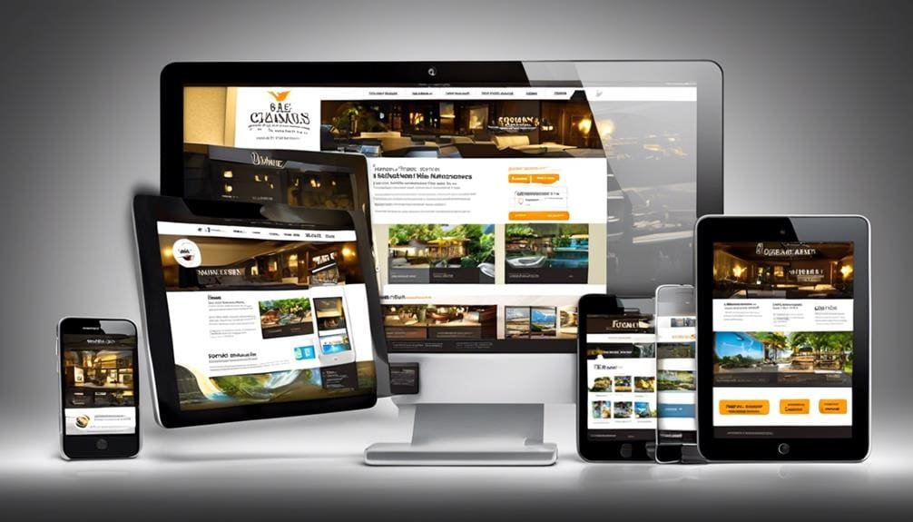
Addressing 404 errors by using custom 404 pages and implementing 301 redirects can significantly contribute to ensuring responsiveness and mobile-friendliness of the website. In addition to addressing 404 errors, prioritizing responsive design is crucial for catering to the needs of mobile users. Responsive design allows your website to adapt seamlessly to various screen sizes, providing an optimal viewing experience for all visitors. It is essential to test your website's responsiveness using tools like Google's mobile-friendly test to identify and rectify any issues that may hinder mobile usability.
Optimizing page elements, such as menus and spacing, is also vital for ensuring smooth navigation and readability on mobile devices. Embracing a mobile-first approach to design further emphasizes the importance of considering the needs and expectations of mobile users as a priority. By incorporating these practices, you can elevate the mobile-friendliness of your website, ensuring that it delivers a consistent and user-friendly experience across all devices.
Consider Local Maps Integration
Considering the integration of local maps can significantly enhance the user experience by providing location-based information. Local maps integration is crucial for improving local website UX. Here's how to maximize its impact:
- Size and Location: Ensure the map is appropriately sized and strategically placed on the website for easy access and optimal usability.
- Select the Right Provider: Choose a reliable map provider like Google Maps or Apple Maps to guarantee accurate and up-to-date location information for users.
- Default View: Select the default map view (satellite or map) based on the type of information you want to convey, ensuring relevance and enhancing the user experience.
Incorporating local maps into your website not only provides users with valuable location-based information but also guides them to physical store locations, ultimately improving overall user engagement. By carefully considering the integration of local maps and following these best practices, websites can effectively enhance the user experience and provide valuable, actionable location-based data.
Streamline Payment Systems
To further enhance the user experience and facilitate seamless interactions on the website, integrating a streamlined payment system is essential. Making the payment process easy for visitors is crucial for improving user satisfaction and conversion rates. Here's an overview of essential elements to consider when streamlining payment systems:
| Key Elements | Description |
|---|---|
| Clear Navigation | Ensure easy access to payment options with intuitive navigation, reducing user effort. |
| Multiple Payment Options | Provide diverse and secure payment methods, clearly stating accepted options to build user trust. |
| Optimized Checkout Process | Streamline the checkout process and forms to reduce user frustration and increase conversion rates. |
Frequently Asked Questions
How Do I Optimize My Website for Ux?
We optimize website UX by focusing on navigation and user engagement strategies. Clear hyperlinks and engaging calls to action improve user experience. Prioritizing white space and bullet points enhances readability and information accessibility, driving user satisfaction.
In What 3 Ways Do You Think Our Website Could Be Improved?
We could enhance our website navigation by incorporating a sticky menu for easy access to key sections. Additionally, improving mobile responsiveness will ensure a seamless user experience across all devices.
How Do I Combine SEO and UX to Improve My Website?
We can combine SEO and UX to improve website performance by aligning strategies with user behavior, enhancing loading speed and mobile responsiveness, utilizing compelling calls to action, implementing local maps, and analyzing user experience metrics for optimization.
How Can I Improve My Website UI Design?
Improving website UI design involves optimizing color palettes and typography for user engagement and accessibility. We've found that vibrant color schemes and clear, legible fonts enhance user experience, resulting in increased interaction and accessibility.
RELATED POSTS
View all

