When it comes to local website design, the saying "home is where the heart is" rings true. Our team has gathered 15 essential tips for creating a superior user experience tailored to local businesses. From optimizing location-based features to crafting compelling calls to action, each tip is a crucial building block for a successful website. But it doesn't stop there – we'll also explore the strategic use of visual elements, the seamless integration of payment systems, and the power of impactful storytelling. Join us as we uncover the key elements that make local website design not just functional, but exceptional.
Target Local Audience
To effectively target our local audience, we need to understand their characteristics, goals, and needs through the use of user personas. User research is crucial in uncovering the unique traits and preferences of our local audience, whether they are in San Diego or New York. By creating detailed user personas based on this research, we can tailor our local website design to meet their specific needs and expectations. For instance, understanding the cultural norms, values, and beliefs of our local audience allows us to incorporate elements into the website that resonate with them on a deeper level.
In addition, optimizing the user interface for location-based features can greatly enhance the user experience for our local audience. This may involve incorporating map features that are relevant to their specific geographical location and ensuring that the website design seamlessly integrates with these elements. Furthermore, implementing payment systems that blend with our local website design not only enhances security and trust for local customers but also creates a seamless and familiar experience for them. By prioritizing the needs and characteristics of our local audience, we can create a website that truly resonates with them, fostering a strong connection and driving engagement.
Clear Navigation
Understanding the unique characteristics and preferences of our local audience allows us to seamlessly integrate clear and easily accessible navigation into our website design. Clear navigation is a fundamental aspect of user experience (UX) and plays a significant role in ensuring user satisfaction. By incorporating intuitive design elements, such as well-defined navigation labels and breadcrumb trails, we can guide users effectively and enhance the ease of use on our website. Clear and concise calls to action within the navigation further direct user attention to key areas of the website, ultimately improving the overall user experience. Prioritizing responsive design is also crucial as it ensures that our navigation remains seamless across various devices and screen sizes, catering to the diverse preferences of our local audience. By focusing on clear navigation, we can create a user-centric website that prioritizes ease of use and ultimately enhances user satisfaction.
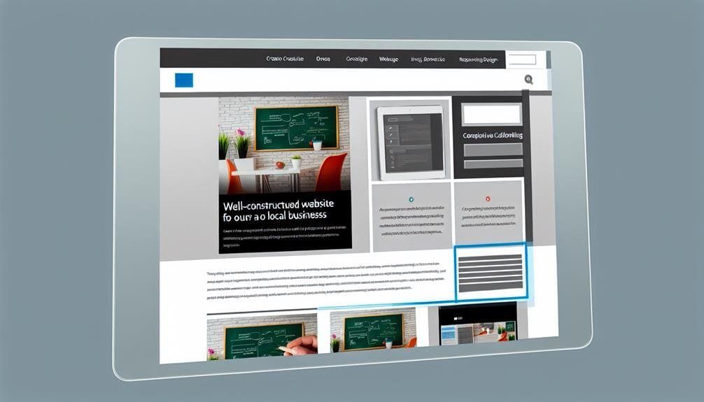
Prioritize Content

When it comes to designing a successful local website, prioritizing content is key. Clear messaging hierarchy, engaging multimedia content, and a mobile-friendly layout are all essential components to consider. By understanding the importance of these points, we can effectively guide user attention, meet their needs, and create a seamless browsing experience.
Clear Messaging Hierarchy
Establishing a clear visual structure by prioritizing content based on importance is crucial for guiding users' attention effectively and ensuring easy access to critical information. By using clear messaging hierarchy, we can ensure that important information stands out and meets user expectations and needs. To achieve this, visual hierarchy and the arrangement of visual elements play a significant role in guiding users through the website seamlessly.
| User Expectations | User Needs | Clear Messaging Hierarchy |
|---|---|---|
| Easy navigation | Access to critical info | Prioritize important content to guide attention effectively |
| Quick access to info | Seamless experience | Organize information based on importance for easy access |
| Clear understanding | Relevant information | Ensure essential information stands out for users |
This approach not only enhances user experience but also ensures that users can easily find the information they are looking for.
Engaging Multimedia Content
To seamlessly integrate engaging multimedia content and prioritize its relevance within the website design, we leverage the same principles of clear messaging hierarchy used to guide user attention effectively and ensure easy access to critical information. Engaging multimedia content, such as videos, interactive graphics, and animations, can significantly enhance the user experience design. By strategically placing multimedia elements, we can highlight important information and guide user attention, ultimately improving user engagement. It's crucial to optimize multimedia content for mobile and responsive design, ensuring seamless integration across different devices. Regularly assessing the impact of multimedia content on user engagement enables us to refine and tailor the content to better meet the needs of user personas. This approach ensures that multimedia content complements and enriches the overall user experience, leading to a more engaging and effective website.
Mobile-Friendly Layout
With a focus on user engagement and accessibility, our approach to mobile-friendly layout prioritizes content to ensure seamless and effective interaction on various devices. We understand the importance of catering to mobile users, which is why we ensure that our website is responsive to different screen sizes and devices to ensure an optimal user experience. By prioritizing content, we guarantee that the most relevant information is readily available, reducing loading times and enhancing the overall usability of our web pages. This includes selecting legible fonts, optimizing button placement and size, and simplifying design elements to facilitate smooth navigation. Our commitment to mobile-friendly layout not only improves user engagement but also ensures that our website remains accessible and functional across all devices.
Strategic Visual Placement

When it comes to website design, strategic visual placement is crucial for capturing users' attention and guiding their interaction. By establishing a visual hierarchy and strategically placing calls-to-action, we can direct users to the most important elements of the website. Utilizing contrasting colors and sizes for visual elements can further enhance the impact of strategic placement on user engagement and conversion rates.
Visual Hierarchy
Strategically placing visuals on a website enhances user experience by guiding attention to key elements and optimizing the flow of information and interactions. Visual hierarchy, a key aspect of user interface design, ensures that users can easily navigate and comprehend the content. By prioritizing elements, websites can deliver a seamless experience, capturing user interest and improving usability. To achieve an effective visual hierarchy, designers must consider the placement, size, color, and contrast of visual elements. This design process often involves usability testing to ensure that the visual hierarchy aligns with user expectations. Interactive elements, such as buttons and links, should be strategically placed within the visual hierarchy to encourage user engagement. Here's a table to illustrate the importance of visual hierarchy in web design:
| Elements | Importance | Effectiveness |
|---|---|---|
| Placement | Guides attention | Enhances usability |
| Size | Emphasizes content | Improves readability |
| Color and contrast | Highlights key info | Captures attention |
Call-to-Action Placement
Enhancing user engagement and conversions on a local website involves strategically placing call-to-action buttons, a vital component of visual hierarchy that guides user interaction and encourages desired outcomes. When considering call-to-action placement, it's essential to understand user behavior and the impact of visual cues. To grab the attention of the audience, here are key considerations:
- Position call-to-action buttons where the user lands on the page to maximize visibility and prompt immediate action.
- Draw the attention of users by using contrasting colors and compelling, action-oriented language in the call-to-action buttons.
- Analyze user behavior through heat maps to inform strategic adjustments and optimize call-to-action button performance.
Understanding the significance of call-to-action placement and continuously testing different placements can lead to improved user experience and higher conversion rates.
Optimize Page Speed
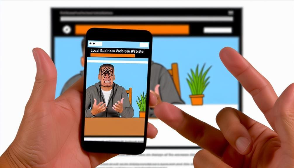
To achieve faster page load times, compressing images before uploading them is a crucial step that significantly improves webpage speed. As web designers, optimizing page speed is essential, especially with the increasing use of mobile devices. Slow load times can lead to usability issues and a high bounce rate, as users are less likely to stay on a website that takes too long to load. It's important to regularly check and optimize page speed, as Google offers a free service to analyze load times and provides recommendations for improvement.
Making design changes, such as reducing image sizes and minimizing HTTP requests, can greatly impact page speed. These adjustments not only enhance user experience but also contribute to a lower bounce rate. A fast page speed is vital for retaining visitors and ensuring that they have a positive interaction with the website. For inspiration, websites like Barnes and Noble exemplify the benefits of speedy load times. By prioritizing page speed optimization, web designers can create a seamless and efficient browsing experience for users.
Mobile-Friendly Design

When it comes to website design, making sure your site is mobile-friendly is crucial. A responsive layout ensures that your website looks great and functions well on all devices. We'll be discussing the importance of responsive design, user-friendly navigation menus, and the significance of fast loading speed for mobile websites. Let's make sure your website is optimized for mobile users!
Responsive Layout Importance
Implementing responsive design is crucial for ensuring optimal usability and readability across various devices, including mobile phones and tablets. When considering the importance of responsive layout in website design, it's essential to optimize button size and placement for easy accessibility on mobile screens. Choosing legible fonts and readable text is also crucial for optimal readability on mobile devices. Additionally, providing ample spacing for links can help avoid accidental clicks, contributing to a seamless user experience. Regularly testing the website on mobile devices is imperative to ensure that users have a positive experience across all platforms. By prioritizing responsive layout importance, you can enhance the overall user experience and ensure that your website or mobile app caters to a diverse range of users and design options.
User-Friendly Navigation Menu
Prioritizing a user-friendly navigation menu is essential for ensuring seamless accessibility on mobile screens, following the importance of responsive layout in website design. When designing for mobile, it's crucial to optimize button size and placement to enhance the user experience. Choose legible fonts and readable text to ensure that users can easily navigate your site on their mobile devices. Additionally, provide ample spacing for links to prevent accidental clicks on the smaller touchscreens. Regularly testing the website on various mobile devices will help identify any potential issues and ensure a smooth user experience. A user-friendly navigation menu is not only beneficial for the user but also for search engines, as it helps them better understand and navigate your website's elements.
Fast Loading Speed
To ensure a fast loading speed and optimal user experience on mobile devices, it is crucial to prioritize responsive design in website development. When focusing on fast loading speed and mobile-friendly design, consider the following:
- Implement responsive design for usability across various devices, especially mobile screens.
- Optimize button size and placement to enhance accessibility and interaction on mobile devices.
- Choose legible fonts and prioritize readable text for an improved user experience on mobile devices.
These steps contribute to a seamless user experience, optimize content delivery, and positively impact search engine optimization. Regularly testing the website on mobile devices is essential to ensure fast loading speed and an optimal user experience. By incorporating these elements into website design, users can access content quickly and efficiently, leading to higher engagement and satisfaction.
Testing and Iteration

Testing and iteration play a crucial role in refining a website's design based on user feedback and performance data. By continuously evaluating and refining the design, we can identify usability issues, enhance user satisfaction, and improve overall functionality. It's essential to conduct A/B testing, usability testing, and gather user feedback to inform iterative improvements. Iterative design allows for continuous enhancement of the website's user experience based on real user interactions and behaviors. Through testing and iteration, we can fine-tune the website to better meet the needs and preferences of its users.
| Testing and Iteration | Benefits | Tools |
|---|---|---|
| A/B Testing | Enables comparison of two versions of a web page to determine which performs better | Google Optimize, Optimizely |
| Usability Testing | Identifies usability issues by observing how users interact with the website | UserTesting, Crazy Egg |
| User Feedback | Provides valuable insights from users to inform iterative improvements | Surveys, Feedback forms |
Testing and iteration are integral parts of the design process, allowing us to uphold design principles and ensure that the website aligns with UX design best practices. By incorporating iterative improvements, we can continuously elevate the website's performance, user satisfaction, and overall digital experience.
User-Centered Design
User-Centered Design puts the needs of users at the forefront of website design. By understanding user preferences and behaviors, we can create accessible and intuitive experiences. Designing with the user in mind ensures that websites are engaging and meaningful.
User Needs First
Understanding user preferences, needs, and behaviors is essential for prioritizing user-oriented design in website development. When focusing on user needs first, there are essential elements to consider:
- Design intuitive navigation to organize content and structure for easy access to information.
- Develop user personas and conduct user research to gather insights into user behavior and preferences.
- Continuously refine your design based on customer reviews and usability testing through testing and iterating. By incorporating these strategies, websites can ensure an optimal user experience. Additionally, incorporating clear calls to action and responsive design can further enhance the overall UX design. By keeping user needs at the forefront, websites can create an engaging and efficient experience for their visitors.
Design for Accessibility
When putting user needs first in website design, it's crucial to also prioritize accessibility, ensuring that the website is usable by people with disabilities. Designing for accessibility means considering diverse user needs and behaviors to create an inclusive and accessible user experience. To make your website accessible, implement features such as alternative text for images, keyboard navigation, and color contrast. It's essential to test your website with assistive technologies to ensure it's accessible to all users. Following Web Content Accessibility Guidelines (WCAG) is crucial to ensure your website meets accessibility standards. By incorporating accessibility into your UX design, you can make your content available to a wider audience, providing an inclusive and user-friendly experience for all.
Consistent Design

Ensuring consistent design throughout a website is essential for providing users with a cohesive and familiar experience across all its elements. Consistency in design elements, such as colors, fonts, and layout, reinforces the brand and enhances user recognition and trust. To achieve superior UX through consistent design, it is crucial to focus on the following:
- Visual Representations:
- Use consistent visual elements, such as iconography and imagery, to maintain a cohesive look and feel.
- Ensure that images and graphics follow a unified style and tone throughout the website.
- Font Choices and Clear Typography:
- Select a set of fonts that complement each other and remain consistent across the website.
- Maintain clear and easily readable typography to enhance the overall user experience.
- Aesthetically Pleasing Color Palette:
- Create and adhere to a color palette that aligns with the brand and remains consistent across all web pages.
- Consistent use of colors helps in creating a visually appealing and harmonious design.
Effective Hierarchy
Developing a clear hierarchy on a website is crucial for guiding users and creating a visually structured experience. Effective hierarchy prioritizes elements on a web page to lead users through the website intuitively. It organizes content and design elements, helping users understand the importance and relationship between different elements on the page. By establishing a hierarchy, designers can emphasize key information and guide users towards important actions or content, ultimately enhancing the user experience. To illustrate the concept of effective hierarchy, here is a comparison between a website with and without a clear hierarchy:
| Without Hierarchy | With Hierarchy |
|---|---|
| Content appears cluttered | Content is organized and easy to navigate |
| Users may struggle to find important information | Key information is emphasized |
| Visual elements compete for attention | Clear visual structure guides users' attention |
| Lack of white space | Effective use of white space enhances readability |
In professional web design and UX design, incorporating a clear hierarchy is crucial for creating a visually appealing and easy-to-navigate website that aligns with current design trends. Additionally, utilizing alt text for images within the hierarchy further enhances accessibility and user experience.
Contextual Relevance

To ensure a website's contextual relevance, it is imperative to tailor the content and features to specific circumstances, incorporating familiar symbols, visual representations, and language that resonate with the target audience. When focusing on contextual relevance in website design, we should consider the following key points:
- Understanding the sociocultural context and local preferences is essential for creating a website with contextual relevance. This involves conducting thorough research and analysis to grasp the unique nuances of the target audience's culture and preferences.
- Adapting the design to align with the immediate physical and social environment contributes to contextual relevance. This includes considering factors such as the device being used, the location of the user, and the specific browsing context.
- Considering the experience of different user contexts, such as smartphone users, tablets, and diverse browsers, is crucial for ensuring contextual relevance across various scenarios. This involves optimizing the website to deliver a consistent and engaging user experience across different devices and platforms.
Compelling Storytelling
Creating a captivating narrative is essential for drawing users in and immersing them in a memorable website experience. Compelling storytelling is a powerful tool that can capture the attention of the user and create a lasting impact. By incorporating storytelling elements such as character development, conflict, and resolution, a website can create a visually appealing and emotionally engaging experience. This use of storytelling not only draws the attention of the user but also creates an emotional connection, making the content more relatable and impactful.
Visual storytelling through the use of imagery, videos, and animations can further enhance user engagement and understanding. It provides a dynamic and interactive way to convey information, making the website more compelling and immersive. Effective storytelling has the ability to differentiate a website from its competitors, leaving a lasting impression and fostering brand loyalty. It is through the art of compelling storytelling that a website can truly connect with its audience, leaving a memorable and long-lasting impact.
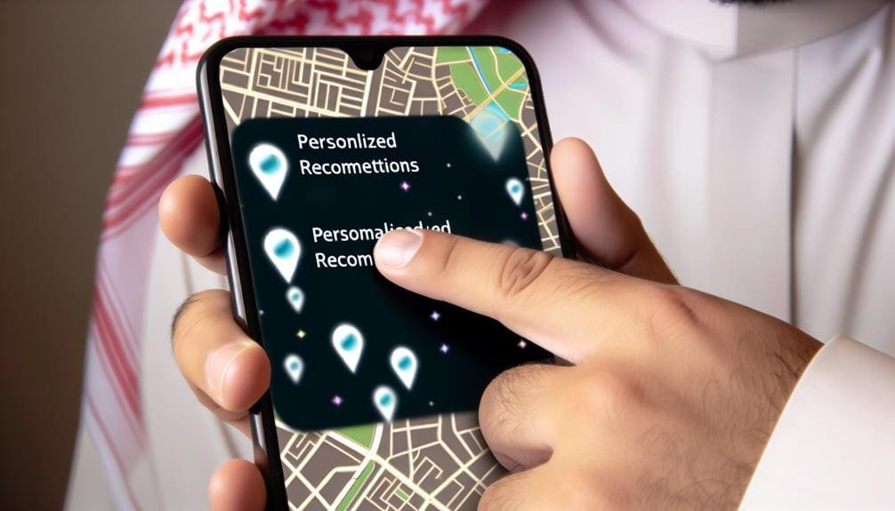
Maps Integration
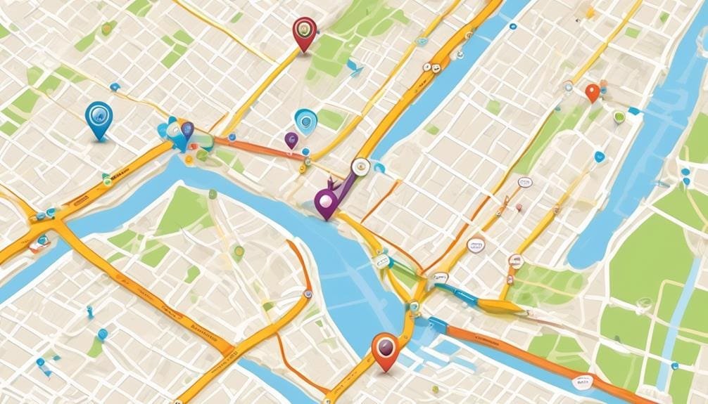
Enhancing local website design with maps integration significantly improves user experience and engagement. When it comes to website design, incorporating maps into the user interface can greatly enhance the overall UX design. Here are some key points to consider when integrating maps into a local website:
- Location-Based Information: Maps integration allows potential customers to easily access location-based information, making it convenient for them to find businesses, services, and events in their area.
- Optimization for User Experience: Choosing the right map provider and optimizing the map's size and location on the web page is crucial for providing a seamless and engaging experience for users.
- Default View Options: Integrating maps with default view options, such as satellite or map view, enhances user interaction and engagement, allowing users to customize their search experience.
Incorporating maps into local website design not only provides valuable information to users but also enhances the overall usability and engagement of the website. By leveraging maps integration, businesses can effectively connect with their local audience and provide a more immersive online experience.
Seamless Payment System
How can a local website design be optimized for a seamless payment system, enhancing user experience and maintaining brand consistency? Implementing a seamless payment system is crucial for creating a positive user experience and maintaining brand consistency. By integrating payment forms seamlessly into the website design, we can streamline the payment process and create a cohesive user journey. Utilizing SSL with the payment system not only enhances security but also builds customer trust, demonstrating our commitment to protecting their sensitive information. To improve the overall design and user experience of the local website, it's essential to optimize payment processes, ensuring that they are intuitive and efficient. By incorporating simple and effective practices for the payment system, we can elevate the local website design, making it easy for users to complete transactions.
| Key Considerations | Description |
|---|---|
| Seamless Integration | Integrate payment forms seamlessly into the website design. |
| Security | Enhance security and customer trust by using SSL with the payment system. |
| Optimization | Optimize payment processes to improve the overall design and user experience of the local website. |
| Brand Consistency | Maintain brand consistency through the seamless integration of payment forms. |
| User Experience | Create a cohesive user journey by streamlining the payment process. |
Impactful Calls to Action

To maximize user engagement and prompt immediate responses, impactful calls to action should employ actionable language and utilize contrasting colors to make them visually striking and easily noticeable. When crafting calls to action, keep in mind the following key points to grab the attention of your audience:
- Actionable Language: Use strong and persuasive wording that compels users to take immediate action, such as "Get Started," "Sign Up Now," or "Learn More."
- Contrasting Colors: Utilize colors that stand out against the website's background to make the call to action visually striking and easily noticeable.
- Strategic Placement: Analyze user behavior using heat maps to optimize the placement of calls to action, ensuring they are prominently displayed throughout the website to drive user engagement.
Frequently Asked Questions
How Do I Optimize My Website for Ux?
Optimizing your website for UX involves mobile responsiveness, simple navigation, visual hierarchy, content organization, effective call to actions, and loading speed optimization. We prioritize these elements to enhance user experience and drive engagement.
What Are the Top Five Key Elements to Remember While Designing a Website?
When designing a website, we focus on the color scheme, navigation bar, mobile responsiveness, call to action, loading speed, and content organization. These elements are crucial for creating a superior user experience and engaging website design.
What Is the Number One Rule of UX Design?
The number one rule of UX design is prioritizing user research. By understanding user needs and preferences, we can create clear visual hierarchy, interactive elements, mobile responsiveness, and a seamless navigation structure for superior user experience.
What Makes a Good Website Hotjar?
Heatmap analysis, user behavior, page layout, navigation menu, call to action, and mobile responsiveness are vital for a good website. These elements guide our design decisions, ensuring an intuitive and engaging user experience.
RELATED POSTS
View all